Fried Egg Golf
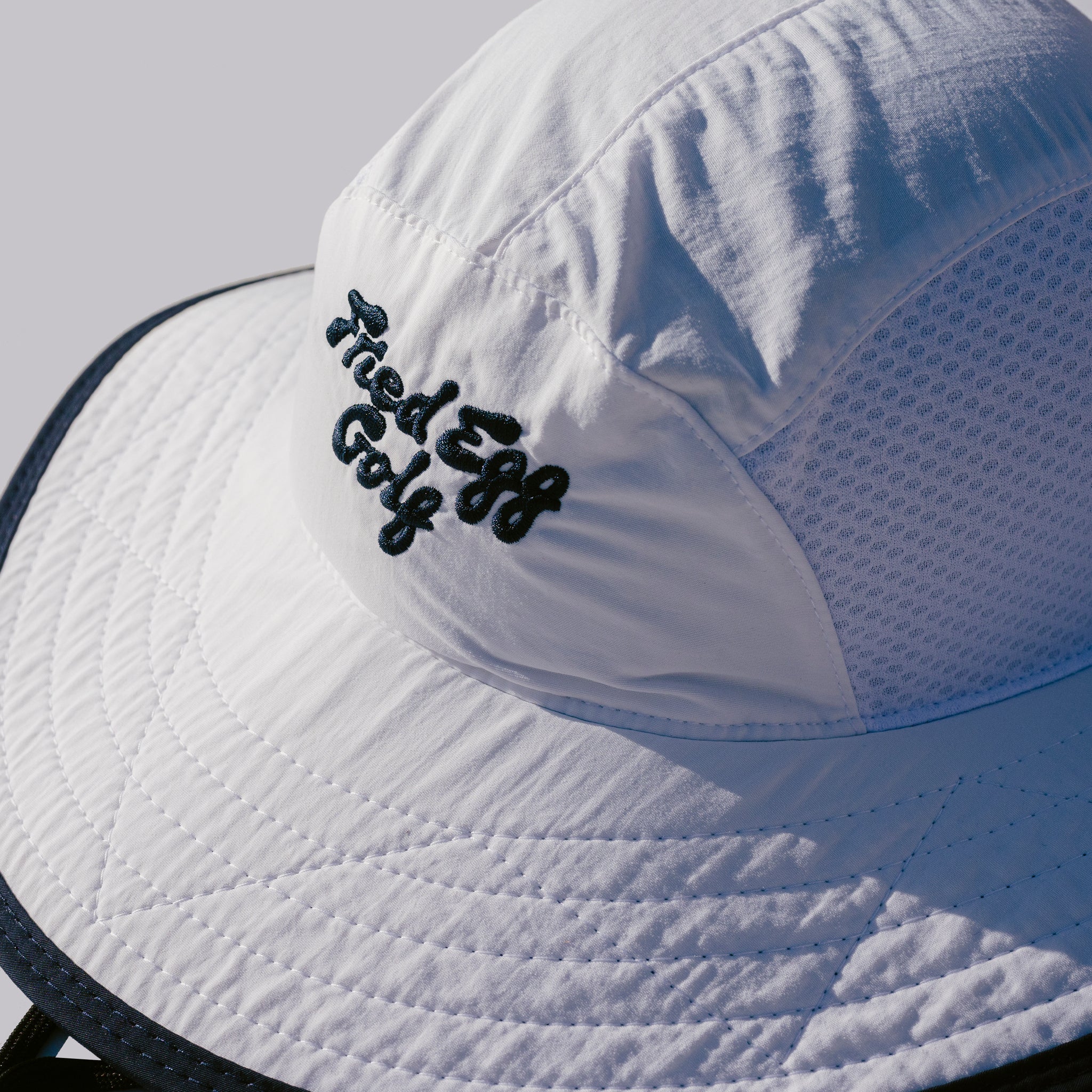
Fried Egg Golf sought a bold rebrand that would not only set it apart from competitors but also provide a bold platform for its distinct voice within the golf media landscape.
The challenge lay in crafting an identity system that felt idiosyncratic, innovative, and completely unique in category while still resonating with its loyal audience. The rebrand needed to strike a careful balance—pushing the brand into a new, uncharted territory without peer but not feeling out of place or alienating to the core of the sport. At the same time, there were real practical considerations including budgetary constraints, publication frequency, and the internal design capabilities that informed the chosen direction.


No items found.


No items found.


No items found.


The color palette was kept simple to put a lot of emphasis on the core brand color, YOLK.


When viewing social posts in aggregate, the original system made it hard to differentiate what type of media was being referenced-podcast, video, interview, article, etc. We created a system based on the shapes used by golfers to mark score cards. The system functions like stickers, providing for simple application and leaving the emphasis on brevity and imagery.


The typeface Grey by Lineto was chosen as the headline font for its easy readability and the quirky curvature of its letterforms, referencing the wordmark
Role
Brand Design Lead
Contributions
Creative Direction, Visual Design
Fried Egg Golf
Andy Johnson
Kaley Johnson
Brendan Porath
Peter Steger
Cameron Hurdus
Contributors
Andrew Furth, Strategy
Cameron Hurdus, Photography
Meg Adkins, Merchandise design and production
Fonts
Grey by Lineto
Stanley by Optima